6 Rules for Choosing the Perfect Paint Color
If you've been staring at swatches and still aren't satisfied, the experts are here to help.
By Candace Braun Davison
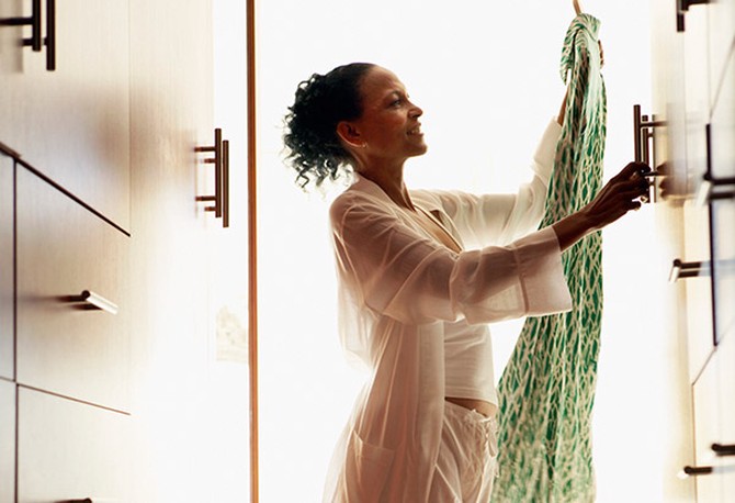
Photo: Thinkstock
1. Boldly Shop Your Closet
Figuring out where to start can be the hardest part. If you don't have a specific color in mind, interior designer and The Big Book of Chic author Miles Redd has a suggestion: Take a closer look at your wardrobe. "Look for the common themes and what colors draw you in," he explains. "If your closet is full of gypsy caftans and old vintage furs, let that inspire what colors you choose."
In fact, your entire paint palette could come from a single item. When you take a picture using a paint-selection tool like Benjamin Moore's Color Capture or Sherwin-Williams' ColorSnap, the app will immediately pull out key colors and match them to the respective brands' paint colors.
In fact, your entire paint palette could come from a single item. When you take a picture using a paint-selection tool like Benjamin Moore's Color Capture or Sherwin-Williams' ColorSnap, the app will immediately pull out key colors and match them to the respective brands' paint colors.
2. Ask Yourself 2 Questions
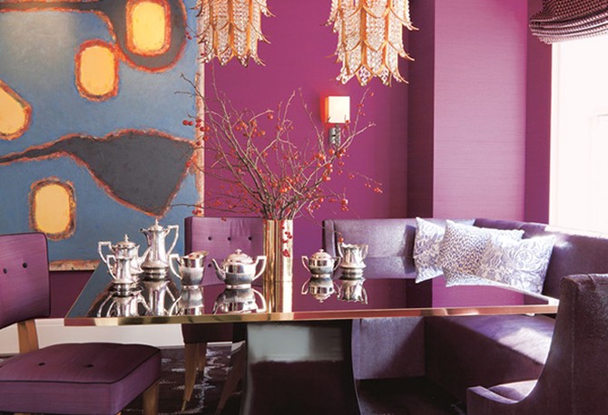
You may have the perfect color in mind for your living room, but there are two factors that can impact which shade you choose: (1) when you'll be using the room the most; and, (2) what mood you want to create. "If you know you want a lively dining room with lots of activity, you might want warmer, more stimulating colors," says Sharon Grech, a Benjamin Moore color expert. Someone who uses the space primarily for brunches and lazy weekend meals might favor light, bright wake-me-up colors; whereas someone who tends to host evening dinner parties might find deeper, darker tones more suitable.
Photo: Roger Davies/Dazzling Design (Abrams)
Photo: Roger Davies/Dazzling Design (Abrams)
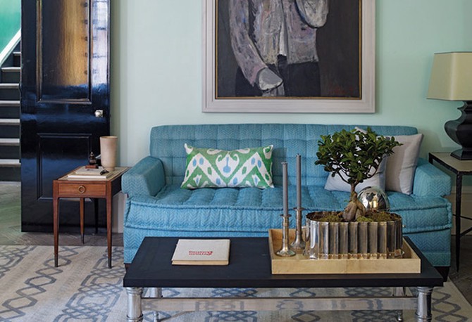
Photo: Eric Piasecki
3. Play Building Blocks
Having certain colors flow from one room to the next can make the whole house feel more pulled-together, but that doesn't mean you need the exact same shade repeated in various degrees. Redd describes choosing colors for your home like layering building blocks: Start with the color you love the most and choose which room would best fit that color—say, a bold peacock blue to energize an entrance hall where you greet people—and think of other shades that could carry a hint of that color from one room to the next. "A paler shade is almost like a shadow of that bolder color," he explains.
The other building blocks don't have to be limited to paint either. In fact, a room can be more interesting if you use other shades of the color in different textures, like wallpaper, cork or fabric-lined walls, he says.
The other building blocks don't have to be limited to paint either. In fact, a room can be more interesting if you use other shades of the color in different textures, like wallpaper, cork or fabric-lined walls, he says.

Photo: Thinkstock
4. Move That Swatch
No one wants to go through the hassle of painting a room, only to finish and feel like it's all wrong—or, just as awful, feel like you didn't really change anything at all. The surest way to fix that comes down to where you place the paint chip when you're brainstorming colors, says Jackie Jordan, director of color marketing at Sherwin-Williams. People tend to tape it at eye level somewhere arbitrarily on the wall, but when the swatch is by itself it's easy to start comparing a new color to the one that's currently on your walls (or your other swatches). This can lead to choosing a color a shade or two lighter than originally planned, or selecting a color that looks great compared to the existing wall—but not so great when paired with the furniture. Instead, keeping the swatch close to an object you plan on having in the finished room can help you pick a color that works with your style and your stuff.
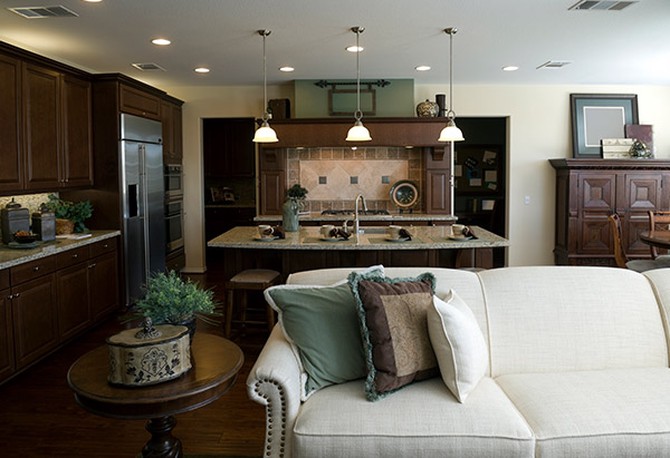
Photo: Thinkstock
5. Look to the Light
If you're considering changing out your lights, the best time to do it is before you select a paint color—not after. Some of today's more energy-efficient models can cast a grayer tone than incandescent bulbs, as Grech learned when she installed LED pot lights. She had to add a few extras to make the room as bright as it was before, and restore the color to the shade she loved.
As you choose potential paint colors, Grech recommends painting a sample area on the wall and taking a look at it in the morning, afternoon and night, so you can see how the light affects it throughout the day. What's most important is how the color looks when you're likely to use the room the most, she says.
As you choose potential paint colors, Grech recommends painting a sample area on the wall and taking a look at it in the morning, afternoon and night, so you can see how the light affects it throughout the day. What's most important is how the color looks when you're likely to use the room the most, she says.
6. Take a Second Look at the Sneaky Shade That Ages Your Home
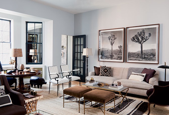
The neutral colors in a home are often overlooked—they go with anything, so why change them, right? But even they can get dated, particularly when the shade is tied to a specific trend. The Shabby Chic era was all about off-white (er, eggshell), the mainstream arrival of Restoration Hardware and Pottery Barn brought us the taupe years, and now, people are starting to gravitate toward shades of gray—and no, not because of the book series. It's been quietly growing in popularity over the past two years, Jordan says, most likely due to the ubiquity of stainless steel appliances and increased interest in streamlined Scandinavian design (think white, light grays and warm wood).
If you're looking for a safe way to update your walls, Jordan suggests three shades: gray with a hint of aqua, such as Sherwin-Williams' Sea Salt (a designer favorite); a warmer shade for rooms that feature reds, oranges and other bright colors (try Amazing Gray); and pale gray with cool undertones for those who prefer blues, greens and purples (Requisite Gray could be a good match).
Next: The fail-safe guide to the perfect paint job
Photo: Roger Davies/The Things That Matter by Nate Berkus
Published 08/19/2013

