The Color Combinations That Will Never Go Out of Style
Choosing one shade is hard enough, but figuring out what to pair with it is like a whole new circle of torture by swatches. These timeless duos (and trios) might make your decision just a bit easier.
By Candace Braun Davison
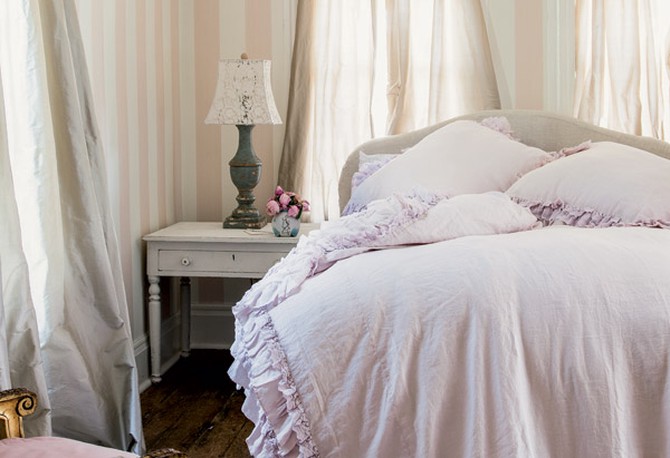
Photo: Amy Neunsinger/Rachel Ashwell Couture Prairie
Smoky Pastels and White: The Little Change That Makes You Rethink Softer Shades
Pale colors aren't just calming—they can look just as fresh 20 years from now as they do today if you follow designer Rachel Ashwell's tricks: Choose a more muted tone for the pastel; and keep the white bright and crisp. Whether you prefer a light pink, green, blue or purple, look for gray undertones, Ashwell explains, which will make it seem less Easter Egg-y and more like a neutral.
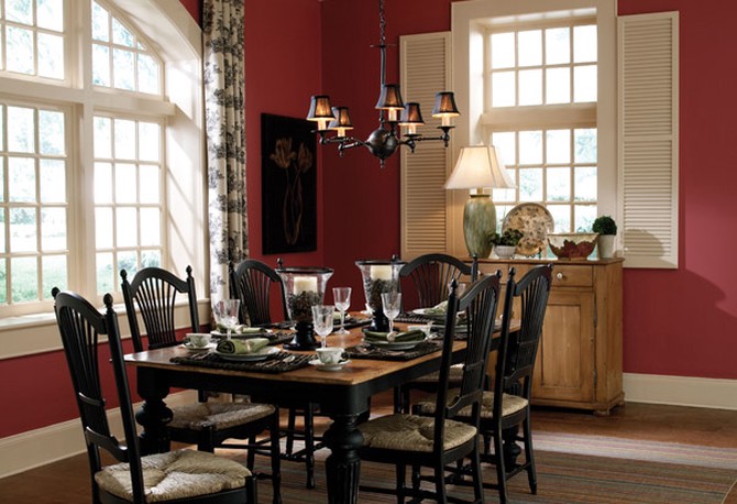
Photo: Courtesy of Behr
Black, White and Red: The Chameleon-Like Trio
Two neutrals with a primary color will almost always work together, but the combination of black, white and red has been particularly popular over the years for its ability to convey different moods. When white and black are prominently featured and a candy-apple red is used as an accent, the room has a graphic, modern feel. For a more traditional home, a dining room in a berrylike red with white trim and black furniture can feel opulent and refined, says Erika Woelfel, director of color marketing at Behr Paints.
To make sure you don't overdo it with any one color, Woelfel suggests following the 60-30-10 rule: 60 percent of the room should be in your main color, 30 percent should be in the secondary color and 10 percent for the accessories (think rugs, throw pillows, frames and art).
To make sure you don't overdo it with any one color, Woelfel suggests following the 60-30-10 rule: 60 percent of the room should be in your main color, 30 percent should be in the secondary color and 10 percent for the accessories (think rugs, throw pillows, frames and art).
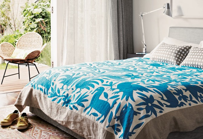
Photo: James Geer/A Place Called Home
Blue and Gray: The Two Shades That Telegraph Tranquility
When it comes to creating the ultimate serene escape, take inspiration from the seaside with an ocean blue and a silvery gray, like the shoreline on a foggy morning, says Jason Grant, interior designer and author of A Place Called Home. Since both shades are cool tones, there isn't as much contrast between them, which makes the duo easier on the eyes. Sea and sky colors tend to be a safe bet because they're so commonly found in nature that they're less likely to be pegged as the "it" tones of a certain decade, like the avocado '70s or mauve '80s.
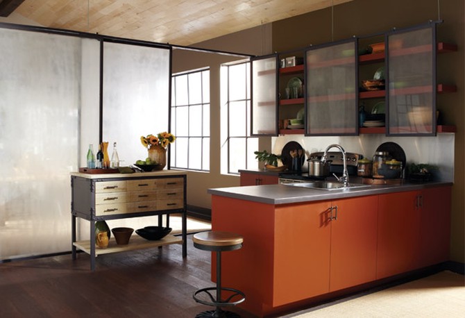
Photo: Courtesy of Behr
Burnt Orange, Olive and Taupe: The Surprising Combination That Adds Warmth
Orange may be one of the most intimidating colors to decorate with, but in a rusty, darker shade, Woelfel says it can work in just about any room. It's particularly effective in colder climates, where the warm tone can enliven even the dreariest day. By pairing it with olive green and taupey grays, it becomes more mellowed out and creates a look that's inspired by the fall harvest, not cribbed from a Hawaiian shirt. Woelfel recommends using an orange that’s in a rich, pumpkin shade and a gray that veers closer to taupe. We like Caramelized Orange (or Hipsterfication, as painted on the kitchen cabinets shown here), and Rolling Pebble.
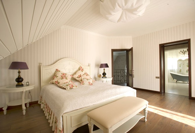
Photo: Thinkstock
Bright White and Creamy White: The Fresh Pair That Puts Your Décor in the Spotlight
It hardly seems like a color combination—until you see the dimension that creamy, off-white walls get when edged in crisp, white trim. The bright white makes the cream-puff-colored walls glow, says Woelfel, and creates a blank canvas that lets the art, curtains and furniture shine (no matter how your taste evolves over the years).
When choosing shades of white, look for yellow or reddish undertones if you want a warmer room. If you favor cool shades, try a blue undertone. Whichever you go with, it's important to make sure the undertones match for both the bright and off-white, or they could clash, making the room feel like something's not quite right. And remember to consider the color of the furniture and carpeting in the room, which will bring out the warm or cool undertones in the paint, Woelfel says.
Next: 6 rules for choosing the perfect paint color
Published 11/07/2013

