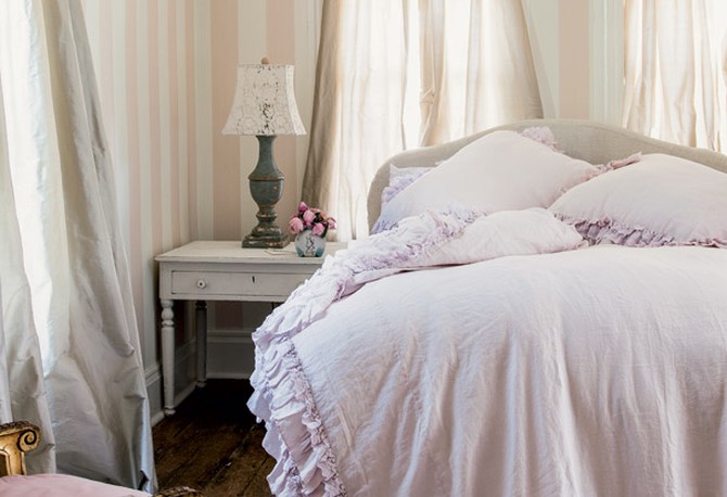
Photo: Amy Neunsinger/Rachel Ashwell Couture Prairie
Smoky Pastels and White: The Little Change That Makes You Rethink Softer Shades
Pale colors aren't just calming—they can look just as fresh 20 years from now as they do today if you follow designer Rachel Ashwell's tricks: Choose a more muted tone for the pastel; and keep the white bright and crisp. Whether you prefer a light pink, green, blue or purple, look for gray undertones, Ashwell explains, which will make it seem less Easter Egg-y and more like a neutral.
Published 11/07/2013