4 Incredible Colors for Your Bedroom
Whether you're looking to repaint your walls or just freshen up your décor, the author of
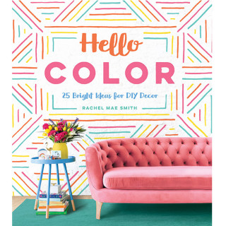
Hello Color reveals the soft, subtle shades you'll want to try—plus tips on incorporating them into your space.
By Rachel Mae Smith
Get Colorful with Pastels
If you're looking to transition away from what I like to call "apartment beige" but aren't quite ready to go over-the-top bold, pastels are a nice, subtle way to add color to your entire home. Unlike other colors that start with a base and then add a small amount of white or black to be lighter or darker, pastels start with a white/cream base and add only a small amount of color to it, making these colors much paler. They're desaturated without being completely white, making them the perfect solution if you want just a hint of a hue.
Even though pastels tend to read as soft—and they're not as intimidating as bold or bright colors—it's completely understandable to be hesitant about them. If you get the wrong shade, your home could end up looking like an oversized nursery. But I'm your color tour guide and I would never put you in that situation! To keep your home sophisticated and oh so adult, here are some go-to choices that are sure to give you great results.
MILLENNIAL PINK:
Certainly the "it" color of (apparently) an entire generation, but to me it's still a color classic. This soft rosy hue can be paired with a warm gray or white for a light and airy look, or with black and gold for a more dramatic effect.
POWDER BLUE:
Pair this cool tint with richer colors like navy and red to avoid making rooms look like a baby nursery.
MINT:
Fresh and classic! For a monochromatic look, try painting mint alongside hunter green and gold. Mint also looks great with whites.
PEACH:
A major step up from traditional beige—it has much more warmth and brightness. Contrast this color with rich brown furniture or floors.
How to Apply
Instead of using lots of pastels together (and making your home feel like an Easter basket), add them as soft accents instead. When in doubt, stick with one. You'll also want to avoid pairing pastels with bold colors in equal proportion. Because the hues of the colors have different vibrancies, they will clash more than complement if used in the same amount in a given space. Pastels tend to look best when they're complementing a richer color either as an accent or dominating as the only color in a white space. They're a bit tricky to work with, but when done right, they can make a room come across much softer and inviting.
If you're consider updating your interior paint with pastels, start by covering just a wall or two. It's important to test the color on the wall before committing: because the color is so subtle, it can read dramatically different depending on the light. However, the nice thing is that you can paint over a pastel paint job more easily than most other colors, so don't be afraid to have a little fun. And if you really, really can't paint your walls, trying putting up an oversized wall hanging in a lovely pastel shade.
Give It Some Depth
Pastels don't have to be flat. If you're ready to experiment with wallpaper, pastel patterns are a great choice since their softness keeps them from being overwhelming. Everything from geometrics to light textured patterns looks lovely in pastels, but floral designs are a particularly natural fit for lighter tints.
Get Restful and Relaxed
Soothing pastels in the bedroom can help you unwind at the end of the day. But don't limit yourself just to wall colors and textiles—even your wall art can bring in a nice soft pastel shade (like that beautiful sky behind the palm trees!). A bold accent accessory will keep the room looking grounded and mature.
Lighten Up Your Furniture
Furniture might not be the first thing to come to mind when considering where to add pastels, but I absolutely recommend it. This mint green softens the more industrial texture of the wall and picks up some of the leafy color of the plant—win win! If you're painting furniture yourself, opt for white or light-colored pieces (or prime them first) to keep the pastel nice and soft.
 Excerpted from Hello Color: 25 Bright Ideas for DIY Decor, by Rachel Mae Smith. Reprinted with permission from Quirk Books.
Published 05/31/2018


