The 2015 Color of the Year (and 7 Ways to Decorate With It)
Pantone's surveyed the design, entertainment and tech fields to predict this year's "it" shade—and it instantly warms up any room. Here's proof.
By Candace Braun Davison
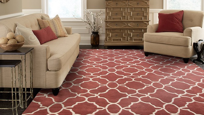
Photo: Courtesy of Oriental Weavers
And the Winner Is...
Every year, the Pantone Institute looks at all realms of pop culture—from movie sets to the latest tech trends—to determine the color they believe you'll be seeing everywhere in the year to come. (Remember Meryl Streep's infamous speech about how the color cerulean became popular in 2006's The Devil Wears Prada? It was Pantone's pick six years earlier.)
This year's choice? Marsala, an earthy reddish shade that's somewhere between wine and Terracotta. The rich color makes textured surfaces look especially lush, which is why the institute recommends using it for rugs and other plush accessories.
This year's choice? Marsala, an earthy reddish shade that's somewhere between wine and Terracotta. The rich color makes textured surfaces look especially lush, which is why the institute recommends using it for rugs and other plush accessories.
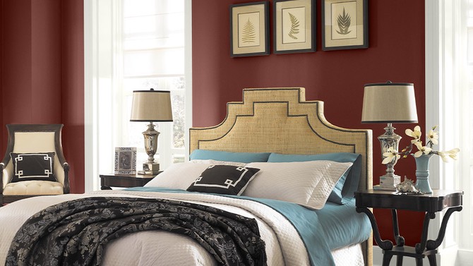
Photo: Courtesy of Behr Paints
Give Your Bedroom That Curl-Up-and-Retreat Feeling
Finally, a color both of you can agree on: Marsala walls are a one-step way to make your bedroom feel more romantic, without skewing ultra-frilly or dark and brooding.
To get the look at home, try Behr's Rich Brocade (pictured), Sherwin-Williams' Red Barn or Benjamin Moore's Cinnabar.
To get the look at home, try Behr's Rich Brocade (pictured), Sherwin-Williams' Red Barn or Benjamin Moore's Cinnabar.

Photo: Björn Wallander
Test Out the Contrast Principle
If you prefer marsala's brown undertones, look for a color that's closer to rust or burnt red. Houzz editor Sheila Schmitz recommends cooling it down with white-matted artwork and deep blue accessories, like designer Nate Berkus did in this home office for Iyanla Vanzant.
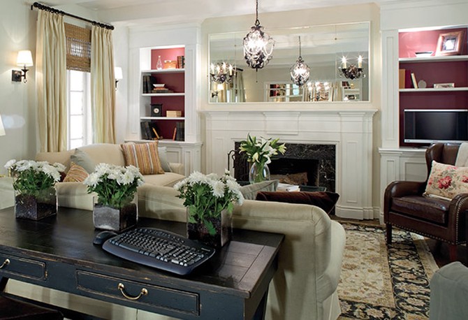
Photo: Copyright Fusion Television
Add Depth to Your Shelves
Painting the inside of your bookshelves a dark color can make them look like they extend much farther back than they do, especially when the rest of the walls are painted a light cream or white, like this room HGTV star Candice Olson designed. The burgundy shade is a refreshing break from the typical choice: navy, gray or greige.
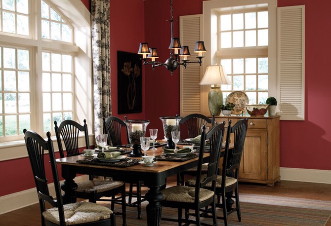
Photo: Courtesy of Behr Paints
Serve It for Dinner Every Night
Pantone predicts that marsala will appear most often in kitchens and dining rooms–and not just for its food-inspired name. Red has long been popular in traditional dining rooms. To keep the room from coming off as cave-like, keep the ceiling and trim bright white.
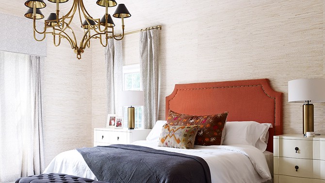
Photo: Björn Wallander
Piggyback on a Larger Trend
Brass accents are everywhere these days, and marsala's warm tones complement it perfectly. Nate Berkus pairs a headboard the shade of a Tuscan sunset with bronze-colored lights and curtain rods, emboldening an otherwise neutral room.
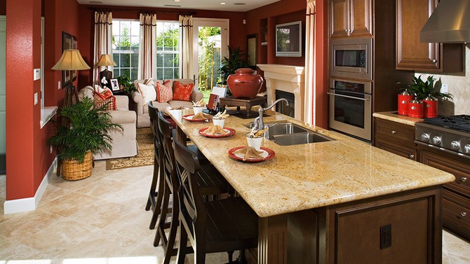
Photo: Fuse/Getty Images
Create Intimate Spaces in an Open Floor Plan
Dark cinnamon-colored walls give this living room a sense of coziness, and the shade is just similar enough to the dark wood cabinets in the kitchen that one room transitions to the next seamlessly.
Published 12/19/2014

