how to decorate with pattern

Photo: © Emily Johnston

Mistake #1: Picking a Pattern Before Considering Its Message

Before thinking about the individual piece you're applying pattern to (or purchasing already patterned), consider the bigger picture of the pattern's purpose within the room. Choose larger-scale patterns for items or areas you want to be the focal point and draw someone toward, and smaller-scale patterns for ones you want to recede into the space or even hide or camouflage. This highlighting or minimizing through pattern can help define the purpose you have for the space and subliminally inform people how to interact or use the space. For example, accentuating a pair of armchairs with bold pattern will encourage people to sit there.
mixing and matching prints

Photo: © Emily Johnston

Mistake #2: Forgetting to Bring Home a Swatch

The easiest and most cost-effective way to understand scale prior to purchasing is to bring home swatches and samples to help you visualize. A small- or mid-size pattern might look busy and complicated when viewed up close and on its own; however, when you pull back and envision it in a space, it may become less bold and more textural.
gemini advice

Illustrations: Rebecca Atwood

Mistake #3: Ignoring the Rules of Proportion

Pattern 40 to 60 percent of your room. This proportion gives you enough excitement but also enough rest. Break up the patterned area into three patterns, with a 60/30/10 proportion.

Above: 60 percent floral rug, 30 percent striped sofa, 10 percent accents

Or five patterns with a 40/30/20/5/5 proportion.


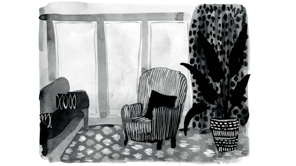
40 percent geo rug, 30 percent dotted curtain, 20 percent striped chairs, 5 percent geo pot, 5 percent decorating curtains
decorating with pattern mistakes

Photo: © Emily Johnston

Mistake #4: Filling Your Room With One-Sized Prints

An assortment of small-, mid-, and large-scale patterns is essential to creating interest and leading your eye around the room. Your collection should include at least one large-scale print, plus a mix of at least two other mid- to small-scale prints. Think about it like this: the largest print creates a little drama, whereas the others support your story.
leo morning routine

Illustration: Rebecca Atwood

Mistake #5: Treating Different Patterns Equally

If you used them all in the same quantity, the space would feel hectic. Create a visual hierarchy. Traditionally, the larger print would be used in the largest proportion, but that's not always the case. You'll be naturally inclined to choose a smaller pattern for a dining chair and larger pattern for a sofa simply because of the size of the object. Don't be afraid to exaggerate the opposite and go for a big, bold pattern on a dining chair or pillow.
patterns

Illustration: Rebecca Atwood

Mistake #6: Omitting Context

As with colors and texture, it's helpful to have a base that you can mix and match with anything. The base isn't necessarily the star of a story, but it is the background information needed to complete the story. Stripes, geos, dots and ditsy prints are your pattern's basic best friends. These basics, also called coordinate prints, can and should tie back to the color or theme of whatever more dramatic piece you're including.


Excerpted from Living with Pattern by Rebecca Atwood. Copyright © 2016 by Rebecca Atwood. Reprinted by permission of Clarkson Potter, an imprint of the Crown Publishing Group, a division of Penguin Random House, LLC.