The 2014 Color of the Year (Plus Other Colorful Ideas)
This shade is bold, vibrant—and much easier to decorate with than you think. These rooms prove that a lush home is only a few brushstrokes (or throw pillows) away.
By Candace Braun Davison
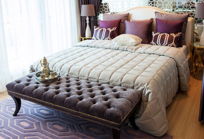
Photo: Thinkstock
And the Winner Is...
Get ready! Pantone, the institute that selects shades for paint makers and tastemakers all over the world, has selected Radiant Orchid as the "it" color for 2014. Chosen for its appearances in spring runway shows and for its ability to wake up more commonly used colors like gray, taupe, beige and white, this lilac-kissed-by-fuchsia is eye-catching, yet not so bright that it's jarring. When paired with a rich plum, like this geometric carpet, and cool silver tones, the shade freshens up old-Hollywood glamour, making your MacBook Air look right at home next to a vintage tufted bench.
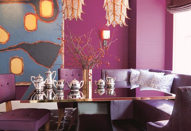
Photo: Roger Davies/Dazzling Design (Abrams)
Search for Illuminating Accessories
The key to working with dramatic colors—like the deep shade of Radiant Orchid in this dining room—is incorporating a few sparkling surfaces to keep the room from becoming too dark and...well...too purple. Here, Dazzling Design author Amanda Nisbet uses crystal chandeliers, a gold vase and a high-gloss lacquer table to reflect light and create a soft glow throughout the area. The effect is sultry; more Juliette Barnes's manor on' 'Nashville' 'than' 'Dark Shadows'' 'Collinwood Mansion.

Photo: Eric Piasecki/Steven Gambrel: Time & Place (Abrams)
Be Fearless—It's Just Paint
In terms of painting, most of us are interested in changing the colors of our living room, according to the 2013 National Home Color Survey. A room revamp can be as simple as creating an accent wall or painting a pop of color on the trim. Or you can take things to a whole new level, like designer Steven Gambrel did. He plucked the Radiant-Orchid-meets-boysenberry shade from a piece of art and applied it to this entire room, from the walls and the sofa to the exposed beams in the ceiling.
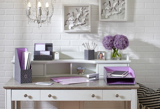
Photo: Courtesy of See Jane Work
Take a Few (Colorful) Baby Steps
If you're not the crack-open-a-gallon-of-paint-and-go type—or you're not a fan of big doses of color—ease into Radiant Orchid by switching out three to five accessories. See Jane Work sells folders, magazine files and other office supplies lined in the color to enliven your desk area, and other companies are rolling out products in the signature shade, like Keurig's Radiant Orchid coffee machine.
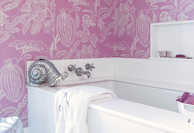
Photo: William Abranowicz/Dazzling Design (Abrams)
Liven Up a Small Space with Radiant Orchid's Milder Side
If you've been thinking about using wallpaper, the bathroom is the place to start—it's small enough that you can tackle it in a weekend. A Radiant Orchid-bordering-on-lilac, like the shade used in this bathroom designed by Nisbet, is soothing, yet the Manuel Canovas print isn't so flowery that the area looks like a Victorian powder room.

Photo: Courtesy of Sherwin-Williams
Or Try the More Toned-Down Color of the Year
Pantone isn't the only brand to crown a color of the year. Sherwin-Williams's Exclusive Plum was selected with décor in mind, and the steely purple feels like the next evolution of the gray trend that's been gaining momentum over the past two years.
Rich, brown leather and copper accents—like a lamp, picture frame or serving tray—warm up the muted purple, keeping the room from feeling dark and lair-like, says Jackie Jordan, director of color marketing at Sherwin-Williams.
(Note: Benjamin Moore chose a pale blue for its color of the year, called Breath of Fresh Air. You can find decorating ideas using it here.)
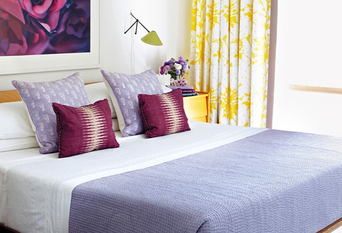
Photo: Victoria Pearson
Let Nature Inspire a Lavender Bedroom
If you're using a mix of warm and cool colors in a room—like the purples and yellows in this bedroom—interior designer and Nathan Turner's American Style author Nathan Turner recommends selecting one color—in this case, yellow—as the "star" of the room and the other as the supporting character. The yellow curtains and side table are attention-grabbing, while the deep purples and pale lavenders serve as mellow counterpoints.
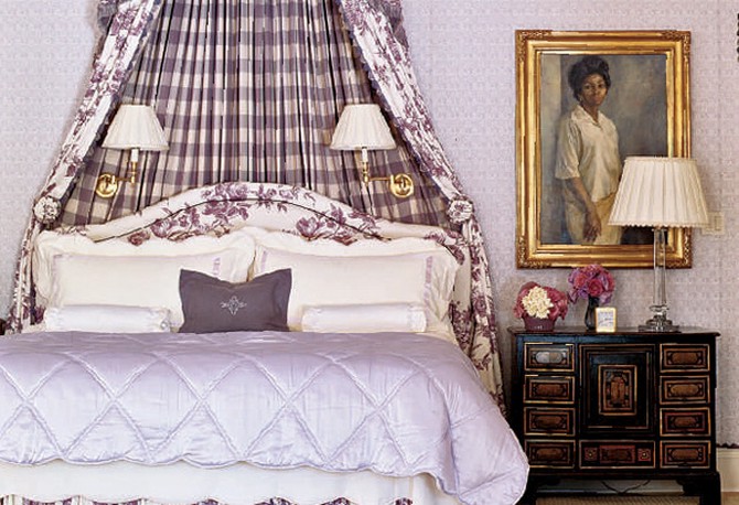
Photo: Michel Arnaud
Take Royal Purple to New Heights with a Canopy
Sometimes, an entire room can be designed around a single piece of fabric. If the patterns are bold, like this reversible plaid/floral number, balance them out with soft, similar colors, recommends David Simmons, who designed this master suite in Oprah's Santa Barbara guest house with partner Andre Walker. "That's why we upholstered the walls in a frosty orchid shade," Simmons says.
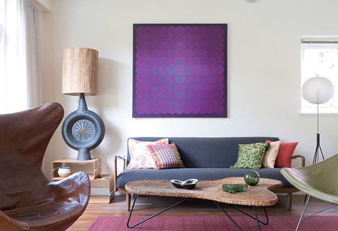
Photo: Andrew Wood/Living Retro (Ryland Peters & Small)
Break This Rule to Make a Deep Purple Really Pop
A large piece of art doesn't always have to be centered above the sofa. In this case, a square of Verner Panton fabric placed just to the left makes the art the focal point of the room. It's a subtle enough change, to complement the surrounding, vintage furniture—instead of compete with it.
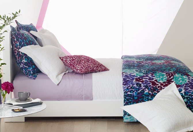
Photo: Kana Okada
Go Simple—and Striking
Lavender sheets and white pillows make Diane von Furstenberg's purple, aqua and teal leopard print comforter feel fierce, not ferocious. The look is bold enough that the rest of the room can be fairly unadorned—perfect for renters (or anyone who dreads the thought of painting).
Next: The new neutral that goes with everything
Next: The new neutral that goes with everything
Published 01/13/2014

