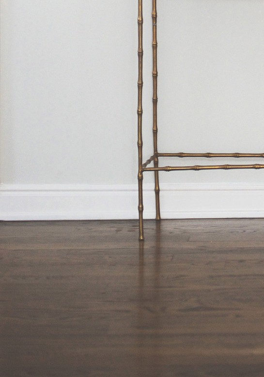
Bright trim makes a room seem crisper, cleaner and more "finished," but too much contrast between the trim and wall color can make the space seem
smaller than it is. Schuman recommends choosing a trim paint that's 25 percent lighter than the walls, creating a pulled-together look that doesn't sacrifice your sense of spaciousness. (She also relies on an art gallery trick for keeping the trim bright: A little Fantastik on a paper towel makes it easy to erase scuffmarks.)
Photo: Reprinted with permission from Cupcakes & Cashmere at Home by Emily Schuman, ABRAMS, Spring 2015