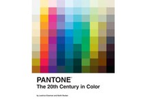
Pantone: The 20th Century in Color
By Leatrice Eiseman, Keith Recker
204 pages;
Chronicle Books
Luxuriating over the names
and choices of paint colors—Rubine Red, Rhodamine Red or Warm Red?—is one of
the joys of going to the hardware store, even if you're only there to find a
missing screw for the air conditioner and not a new shade for the living room walls. For anyone
who relishes that time-sucking trip down the chip aisle, salivating over Purple
Opulence and Moonless Night, Pantone: The 20th Century in Color is a must-give. What surprises, however, is the
larger historical picture that the hefty tome creates. The colors are organized
by decade and by timely reference, including the fashion, television, news, art
and design that inspired them. In the '70s, Spinach Green and Vibrant Yellow
came right of out Oscar the Grouch and Big Bird from Sesame Street. In the '80s, Rich Gold, Deep Forest and Crimson came
right out of the marriage of Prince Charles and Lady Diana. The less-familiar
decade of the '30s was infused with Poppy Red and Blue Bell from The Wizard
of Oz. One has to wonder after a while
which came first: the colors or the iconic event that supposedly gave birth to
them? Most telling—and worth a second look—is the section on the '90s, whose
influences included everything from the nameless orange of Apple computer "geek
chic" to the Champagne Beige of conspicuous consumption. Eleven years
after that particular time period, it's interesting to note how very much
has—and hasn't—changed.
— Leigh Newman


